• After 15+ years, we've made a big change: Android Forums is now Early Bird Club. Learn more here.

Rob

Galaxy S20 Ultra
News Moderator
Administrator
  • Thread starter
    Mar 26, 2008
    2,935
    5,159
    42
    androidforums.com
    I've had the "Camera Club" at the top for a few days: any feedback? Should we have something more fun and recurring at the top, keep the simple old school forum structure, go back to "New Posts" as the default, or something else entirely?

    We've bounced back and forth over the past 10 years with what appears on the homepage. What would you ideally like to see?
     
    • Like
    Reactions: AugieTN
    If you consider what the missing path for Javascript has given us ... (or whatever is causing the invisible log in button)

    Members know to hover over the area where the log in button should be, (just left of the register button)

    Non-members only need the register button anyway, me thinks it is kinda cool, like a secret decoder ring thingy ....

    I dabbled in HTML years ago and there were some neat "tricks" one could play on sites that had HTML enabled, like disappearing/hover over things.

    Guess I am getting too old for that, in retrospect is seems it was kinda childish ...

    (NOT!)

    laughinghard
     
    • Like
    Reactions: Dannydet
    Upvote 0
    Personally, I think this site needs more ads :goofydroid:
    When we change the name/brand of the site, I'll be stripping out MOST of the ads.

    Gonna focus a lot more on helpful content that includes non-intrusive affiliate links with some ads sprinkled in here and there. I agree that the ads are overkill and are a distraction to our actual purpose. Although our purpose is also shifting a bit.
     
    Upvote 0
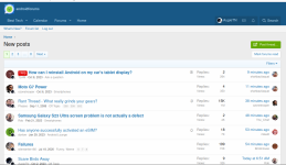
    We seem to have lost the "new posts" filter, both from what was my home page and the "what's new" page. A shame as I used that to find threads I was not up to date with.
    Are you browsing on mobile?

    If so, turn your phone sideways and see if you get the "feeds" view which shows hot threads, new threads, new posts, etc... in neatly organized tabs at the top. This is essentially a better format of the "What's New" section while also including notification count badges and better filtering options.

    I've noticed that they do not appear properly on mobile but appear fine in landscape mobile and desktop

    If that isn't it would love to hear more of your thoughts!
     
    Upvote 0
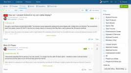
    I can see titles like "hot, threads, posts, social, questions, forum list", but no "new posts"

    If you click "Posts" it will show new posts and you can filter further in the right sidebar.

    If you click threads it shows new threads.

    Same functionality but different terminology. The red bubbles with numbers in them essentially indicate what is new.
     
    • Like
    Reactions: Hadron and mikedt
    removing the incorrect 'new' section on the right corner telling me to 'finish setting up your profile' with the three suggestions being

    1. upload a profile picture

    2. create a new thread

    3. add a signature

    Is that waste of space intended to be a joke? I did the first two in 2010, and the last one is weird since signatures are not even a feature anymore despite various members having very out of date ones.
     
    • Like
    Reactions: Rob and mikedt
    Upvote 0
    If you click "Posts" it will show new posts and you can filter further in the right sidebar.

    If you click threads it shows new threads.

    Same functionality but different terminology. The red bubbles with numbers in them essentially indicate what is new.
    OK, I follow. But I don't know how long it would have taken me to work out - it's straightforward enough once you know, but it's less obvious.
     
    • Like
    Reactions: Dannydet
    Upvote 0
    I
    As a couple others have mentioned a clickable "New Post" label is important.

    A "What's New", "Hot", "Post", "Social" Just doesn't seem to cut it.

    This confuses me...

    Is it the specific phrase "New Posts" that people miss? Its appearance on every page as a simple and easy to find clickable link? Or something else?

    Personally, I think the word "Posts" with a red badge showing the unread count is more logical and helpful. It makes the word "New" a bit redundant since otherwise you'd want to have "New Threads", "New Questions", etc... I've always thought "What's New" is a bit too cumbersome so happy to get away from that but I don't want to slap the word "New" on everything.

    I also don't think "New Posts" will be particularly helpful if we're successful in bringing back our larger community. It will show ALL new posts in ALL forums of the site. In the past, we solved this with a custom feature called "New in Favorites". I think in this setup you can add a tab called "Following" which does something similar (shows new stuff in Threads and Forums that you follow).

    Just trying to better understand what people are actually preferring and looking for here!
     
    • Like
    Reactions: olbriar and AugieTN
    finish setting up your profile
    ^ Regarding this section, it's an onboarding feature designed to encourage participation.

    I'm not sure how well it will work but I like the idea for new members. It definitely isn't perfect and I'm also noticing some weird inconsistencies. For example, it suggests you "Watch your first forum" but the terminology is now "Follow" instead of "Watch" which is likely to confuse people.

    It's definitely not meant as a joke but perhaps in too prominent of a spot.

    Regarding signatures, I still think they're way too problematic in terms of welcoming spam and distracting people from the actual content of each thread. Maybe we could find other ways/place to show signatures but I think profile pages are the best place to keep that "extra" content (and I guess you could post social status updates in lieu of sigs).
     
    Upvote 0
    I was just use to seeing numerous post under New Post.
    Where do you typically prefer to hit the New Posts button? I think a combination of thoughtful naming and putting it in a universal place would be helpful. Having to click around to find the new posts area is annoying to me, too.
     
    • Like
    Reactions: AugieTN
    Where do you typically prefer to hit the New Posts button? I think a combination of thoughtful naming and putting it in a universal place would be helpful. Having to click around to find the new posts area is annoying to me, too.

    Anywhere near the top is fine

    I know you don't want to use "New" here's a couple of synonym suggestions, Up To The Minute, Latest, Current, Recent, Just Arrived, Fresh

    Thanks again for all your work keeping AF going!
     
    • Like
    Reactions: Dannydet and Rob
    Upvote 0
    I know you don't want to use "New"
    I don't mind "New" but it personally confuses me: "New" what? Threads? Posts?

    I would normally assume that "New" meant completely new. So new threads. Whereas new posts would be "Updates" or something of that nature.

    That being said, having "New" link to a page with all new content filterable by type does make a lot of sense. Hmm.
     

    BEST TECH IN 2023

    We've been tracking upcoming products and ranking the best tech since 2007. Thanks for trusting our opinion: we get rewarded through affiliate links that earn us a commission and we invite you to learn more about us.

    Smartphones